The creative process behind a cover...
Posted: January 15, 2010, 12:35
_
The somewhat controversial "Sunpire" (that is to say, Vampires fueled by the sun rather than killed by it) aspects behind Stephen King and Scott Snyder's upcoming Vertigo title "American Vampire" may have some would-be readers wary - especially in lieu of the "Twilight" films' sparkly motifs - but I gotta say, Rafael Albuquerque's art makes me forget all about that noise.
Over at Vertigo's Graphic Content blog, Albuquerque gives readers a rundown on his creative process behind building the cover image for the series' second issue.
It's a pretty interesting look at his approach to composing a striking cover, especially his closing remarks about color choice.
The best part is that, judging from the light sources in the image, fans won't have to worry about the series' fanged protagonist sparkling when the series hits in March.
You can also see more of how the cover was created here.

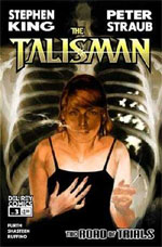
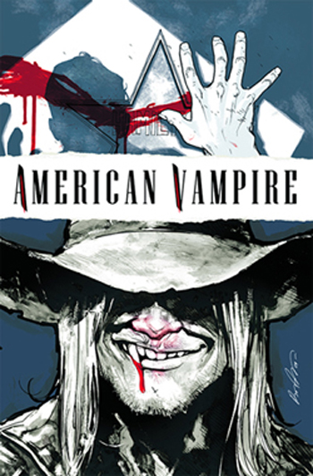 Here is another cover for American Vampire.
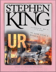 On February 12 UR will be released on audio and the narrator is Holter Graham.
 This interesting info surfaced on the Net today.
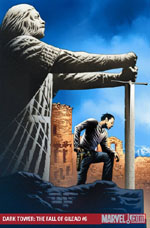
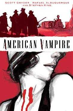 Here is the cover for the upcoming cover American Vampire.
 Under the Dome has been out for a while but it’s not forgotten. I have finished the audio version of it and you can read my thoughts about it