The could have been covers #4
Posted: July 23, 2011, 22:00
_
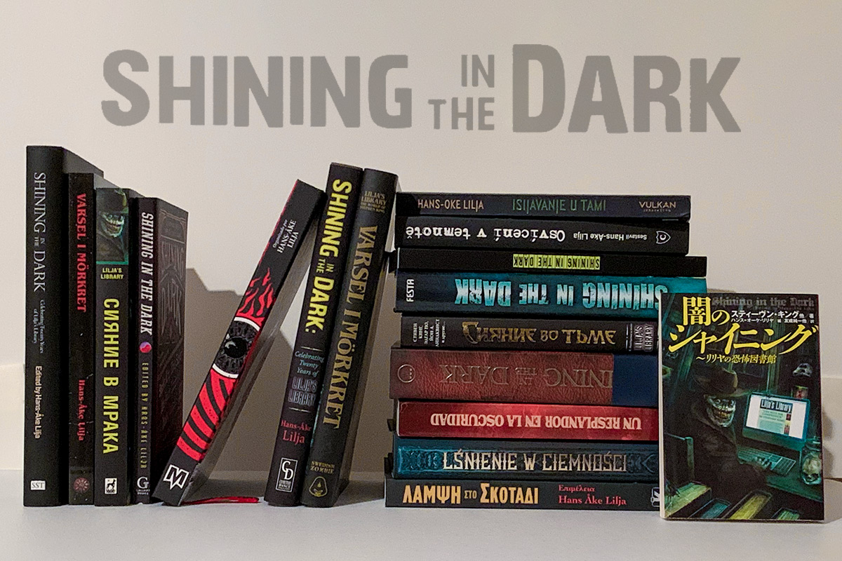
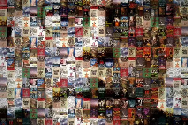
 This one I actually like quite a lot. It’s only real problem is that “Lilja’s Library” is in babe blue which I don’t think is the right color. And that the title of the book is way to long.
Let me know what you think of this cover on facebook or twitter


