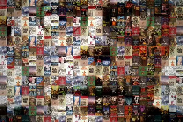
The could have been covers #3
Posted: July 22, 2011, 22:00
_
 This is probably the design that I like the least. The text is good but the way “The book” is put on the cover doesn’t look good at all. Any the font on my name is way too thin.
Let me know what you think of this cover on facebook or twitter

